

A website redesign is worth paying for when it makes it easier for the right customer to buy or enquire. If people reach your service page but leave before requesting a quote, start there. Explore Futura Group’s website redesign services and include the page you want us to review.
In this guide
For a service business, that may mean turning vague service pages into clear sales assets. For an e-commerce store, it may mean making product discovery, checkout, and repeat purchases easier. For a growing company with manual processes, it can mean connecting the website to the workflows that keep leads, orders, and customer requests moving.
When a Website Redesign Is Worth the Investment
A site does not need to look old to be underperforming. Many businesses have modern-looking websites that still fail at the work that matters: generating qualified inquiries, supporting sales conversations, ranking for relevant searches, or converting shoppers.
A redesign is usually justified when the business has outgrown its current positioning. Perhaps you have added new services, moved into a different market, changed your ideal customer, or now need to explain a more complex offer. If your website still reflects the business you were two years ago, it can create friction before a prospect ever speaks with your team.
Performance issues are another strong signal. Slow pages, poor mobile layouts, broken forms, confusing navigation, and hard-to-manage content all cost opportunities. So do pages that attract visitors for irrelevant searches or provide little reason to take the next step.
The answer is not always a full rebuild. If your brand, structure, and technical foundation are sound, focused conversion and SEO improvements may produce better returns. A full redesign makes sense when several problems are connected and patching them individually would create more cost and complexity over time.
Set a Commercial Goal for Your Website Redesign
The fastest way to waste a website redesign budget is to begin with colors, competitor screenshots, or personal taste. Visual direction matters, but it should follow the commercial plan.
Start by defining what the website must help the business achieve over the next 12 to 24 months. A consulting firm may need more qualified consultation requests. An online retailer may need a higher average order value and stronger product-category visibility. A B2B supplier may need to make it easier for buyers to request pricing, compare specifications, and contact the right team.
These goals shape the structure of the site. They tell you which pages deserve the most attention, what calls to action belong on each page, and which proof points need to be visible before a visitor is ready to act.
A practical planning question is: what should happen after someone lands on each important page? The desired action may be a purchase, a quote request, a booked call, a WhatsApp message, a demo request, or a newsletter signup. If that action is not clear, the page is likely asking the visitor to do too much thinking.
Map the Buyer Journey Before You Build
Not every visitor arrives ready to buy. Some are comparing providers. Others are researching a problem, checking credibility, or trying to understand pricing. Your site needs content and pathways for each stage without burying high-intent visitors under too much information.
A strong structure often includes pages that explain the core offer, dedicated pages for priority services or product categories, proof through case studies or reviews, and useful resources that answer common buying questions. The exact mix depends on the business, but the principle is consistent: each page should have a job.
This is where keyword research has real commercial value. It reveals the language buyers use when they are actively looking for solutions. Rather than creating pages around internal company terminology, you can build pages around the problems, services, products, and locations people actually search for.
Build the Website Redesign Around Search and AI Visibility
Search visibility should be part of the planning phase, not an afterthought added once pages are live. A redesign can increase organic growth, but it can also damage existing rankings if URLs, content relevance, internal links, and redirects are handled carelessly.
Before development begins, review the pages already bringing in useful traffic, leads, or sales. Identify their target queries, backlinks, conversion performance, and role in the sales journey. High-performing pages may need better design and stronger calls to action, but they should not lose the relevance that made them visible in the first place.
Your new site also needs clear topical signals. Search engines and AI-powered answer tools look for evidence that a business understands a subject and can answer specific questions. That means writing useful service descriptions, adding original proof, explaining processes clearly, and organizing related content logically.
Avoid creating dozens of thin pages just to target small keyword variations. Fewer, stronger pages with a clear purpose tend to be easier to maintain and more useful to customers. Where location matters, create location-specific content only when you can provide genuinely relevant information for that market.
Protect What Already Works
If your website redesign changes existing URLs, use Google’s site migration guide to plan the move. When page URLs change, permanent redirects must point old pages to the most relevant new equivalents. Redirecting everything to the homepage is a common mistake that frustrates users and wastes existing authority.
You should also review page titles, headings, image text, structured data, internal links, and indexation settings before launch. Test forms, transaction flows, mobile layouts, and site speed in a staging environment. After launch, monitor traffic, rankings, crawl errors, and conversions closely enough to catch issues early.
The redesign is not finished the day it launches. The first few weeks provide valuable evidence about how real users respond to the new experience.
Design for Trust Before Decoration
A polished visual identity helps, but trust is built through clarity. Visitors want to know who you serve, what result you help create, how the process works, and why they should believe you can deliver.
Place the most important message near the top of priority pages. A founder should be able to scan the page and understand the offer in seconds. Then support that message with proof: client results, testimonials, recognizable partners, product details, certifications, team expertise, or a transparent process.
For e-commerce, trust includes clear pricing, accurate shipping information, simple returns guidance, product photos that answer practical questions, and checkout steps that do not create unnecessary hesitation. For service businesses, it includes clear scope, realistic timelines, helpful qualification information, and an easy way to start a conversation.
Design should guide attention, not compete for it. Too many animations, oversized banners, pop-ups, and competing calls to action can reduce confidence rather than increase it. A clean interface is valuable because it makes decisions easier.
Make Conversion a System, Not a Button
Changing “Contact Us” to “Get Started” will not fix a weak conversion path. Conversion depends on the full experience: traffic quality, page relevance, offer clarity, proof, friction, and follow-up.
Every important page should give visitors an appropriate next move. A high-ticket service page might offer a consultation request. An informational article could lead to a relevant service page. A product category might encourage shoppers to compare options or view best sellers. The action should match the visitor’s level of intent.
Forms deserve special attention. Ask for the information your team truly needs to respond well, but do not turn an initial inquiry into an application process. If your sales team qualifies leads later, keep the first form short and make response expectations clear.
Automation can improve the operational side of conversion. A form submission can notify the right person, create a record in your CRM, send an acknowledgment, and trigger an internal follow-up task. This is especially useful for lean teams that cannot afford to let good leads sit unanswered.
Futura Group approaches websites as growth infrastructure, combining design, development, search visibility, and practical automation around the needs of the business rather than treating each as a separate project.
Measure the Results That Matter
Before signing off on a website redesign, agree on how your team will measure success. Track the numbers connected to commercial outcomes: qualified leads, booked calls, quote requests, sales, conversion rate, average order value, organic traffic quality, and revenue from key landing pages.
Set a baseline before work begins. If you do not know how the old site performs, it becomes difficult to prove what the new site improved. Analytics, search performance data, CRM records, heatmaps, and customer feedback can all reveal where the existing experience breaks down.
Give the new website enough time to collect meaningful data, especially if search rankings are involved. Then improve it deliberately. Test page messaging, calls to action, product information, form length, and navigation based on evidence rather than assumptions.
Request a Website Redesign Quote
Compare proposals using a real buying task
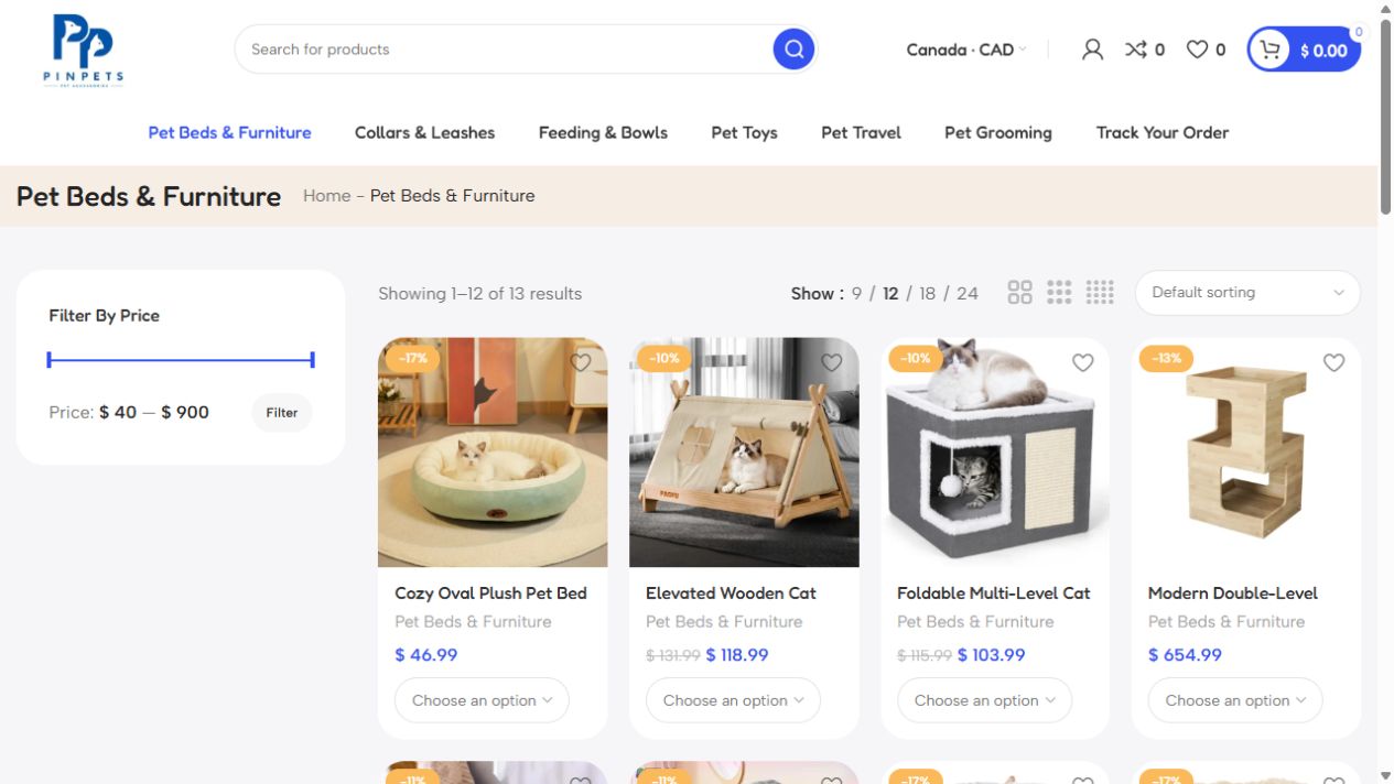
Imagine a customer choosing a harness for a large dog on a phone. One proposal offers a new homepage. Another covers the full purchase: a category page that narrows the options, a product page with a size guide, and a checkout that shows delivery costs before payment. Ask each website redesign provider to price the same journey. Then you can see which items explain the difference between two quotes.

Agree on an acceptance test before commissioning the work. Can a new customer choose a size, see whether it is available, and reach the payment step without losing the selection? For a service site, run the equivalent test with a quote form. Check that the customer sees a confirmation and that the enquiry reaches the person who will answer it.
Ask who supplies the copy, who checks mobile layouts and forms, and who can edit a page after handover. If a proposal excludes migration or analytics setup, price those separately. This makes the website redesign budget easier to compare and gives your team a short checklist for launch day.
Send Futura Group your website address, your most valuable customer action, and one page that loses enquiries or orders. Tell us whether you need a better quote form, a clearer service page, or a simpler checkout. Ask for a proposal that separates the essential fixes from optional work so you can compare costs and choose what to launch first.