

A product page can attract plenty of traffic and still fail at the only job that matters: helping a qualified buyer make a confident decision. Product page conversion optimization is the work of removing that hesitation, answering practical questions, and making the next step feel obvious.
For e-commerce operators, this is not a cosmetic exercise. A stronger product page improves the return on SEO, paid campaigns, social content, email traffic, and marketplace referrals. You do not necessarily need more visitors first. You may need to stop losing the visitors who already arrived ready to consider a purchase.
In this guide
Product Page Conversion Optimization Starts Before Design
Conversion problems are often blamed on button color, page layout, or a missing discount popup. Those details can matter, but they rarely solve the core issue. Buyers leave when the page does not quickly establish what the product is, who it is for, why it is worth the price, and whether buying from your business feels safe.
Start by looking at the traffic source and the search intent behind it. A visitor who searches for a specific product model has different expectations from someone arriving from a broad social media post. The first person may need specifications, compatibility details, delivery timing, and a clear price. The second may need a stronger explanation of the problem the product solves before they are ready to compare options.
This is where SEO and conversion work need to operate together. A page that ranks for the wrong phrase can generate visits that never had a real chance of converting. A page that matches the buyer’s intent, then gives them a clear path to action, creates more valuable organic traffic without increasing ad spend.
Before changing anything, establish a baseline. Review product page views, add-to-cart rate, checkout completion, mobile versus desktop behavior, page speed, refund reasons, customer questions, and support messages. Analytics tells you where the drop-off happens. Customer conversations often tell you why.
Build a Product Page That Answers Buying Questions
A high-converting product page does not make visitors work to find critical information. Its structure should reflect the natural order of a buying decision.
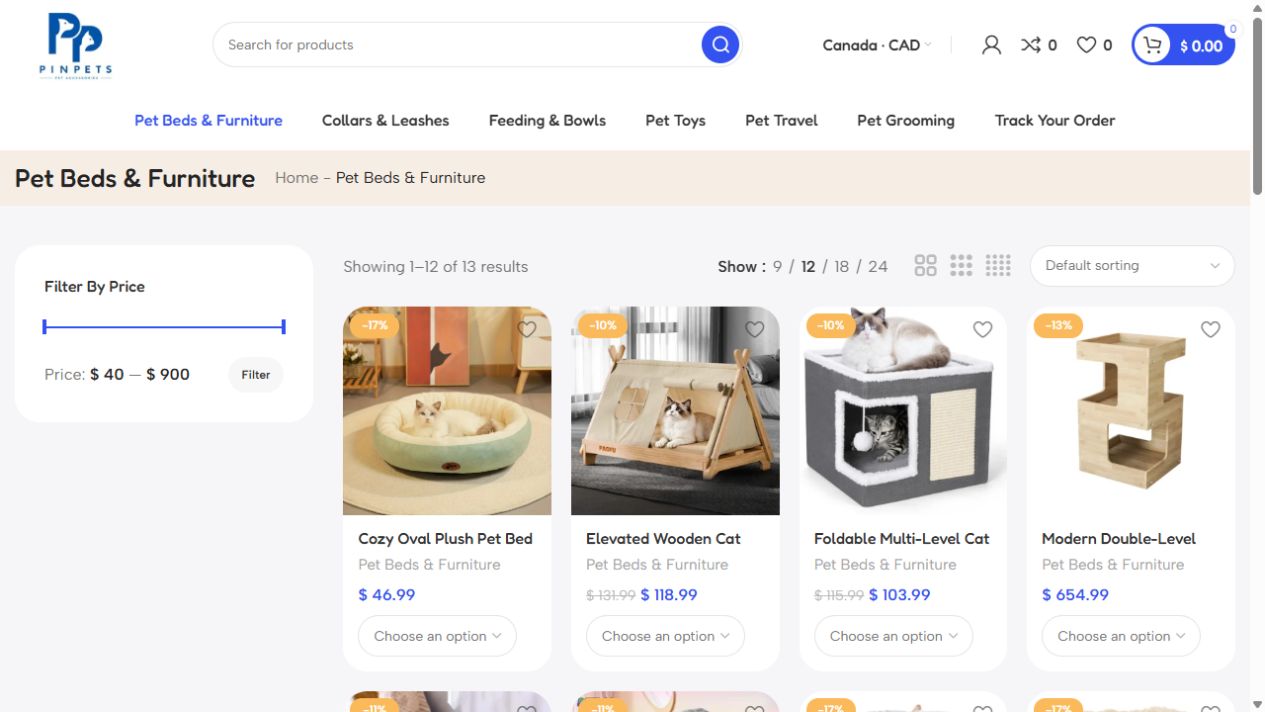
Lead with the product and its practical value
Your product title should be specific enough to confirm relevance. Then use the opening copy to explain the commercial benefit in plain language. Avoid descriptions that only repeat category terms or use broad claims such as “premium quality” without proof.
For example, a pet store selling a cooling bed should not stop at the material and dimensions. It should explain the use case: a washable bed designed to help dogs rest more comfortably in warm indoor spaces, with sizing guidance for common breeds. The product details still matter, but the buyer needs context before technical features carry weight.
The main product image must do more than look attractive. It should show scale, color, texture, fit, or real-life use where appropriate. Use additional images to answer questions a shopper would otherwise ask by email. For clothing, show the item on different body types or include accurate measurements. For equipment, show ports, included components, and installation context. For food or consumables, make ingredients, quantities, and handling information easy to verify.
Make the purchase decision easy to understand
Price, variation options, stock status, shipping information, and the add-to-cart action should be visible without unnecessary scrolling. If delivery time changes by location, state that clearly before checkout. Surprise fees and vague delivery promises are conversion killers, especially for businesses selling across regions.
The product page call to action should describe the action directly: “Add to Cart,” “Buy Now,” or “Choose Your Size.” Creative wording usually creates friction. If a product requires consultation, configuration, or a quote, replace a standard checkout path with a focused inquiry process that explains what happens next.
On a product page, trust signals should appear near the decision point, not be buried in a footer. This can include secure-payment information, returns policy, authentic reviews, warranty coverage, business contact details, or proof of reliable delivery. Only display claims you can support. A short, specific policy is more credible than a large collection of generic trust badges.
Reduce Mobile Product Page Friction
Many small and mid-sized businesses review their website on a laptop but receive most product-page visits on phones. A page that looks polished on desktop can become slow, cluttered, or hard to use on a smaller screen.
Test the journey from the product page to checkout yourself on a mobile connection. Can shoppers swipe through images easily? Is the selected variant obvious? Does the add-to-cart button remain accessible after reading product details? Are form fields manageable? Does the checkout require account creation when it is not necessary?
Mobile optimization is not simply responsive design. It is decision design. Reduce visual clutter around the first action, keep key information close to the purchase controls, and avoid heavy media files that delay the page. Video can increase confidence when it demonstrates the product, but an autoplay video that slows loading may cost more conversions than it gains.
There is a trade-off here. Rich product pages can answer more questions and support organic visibility, while lean pages can load faster. The right balance depends on product complexity. A simple low-cost item may need only clear images, concise benefits, and delivery details. A high-ticket item often needs comparison information, demonstrations, FAQs, detailed specifications, and stronger proof before a buyer commits.
Match Product Page Reviews to the Buyer’s Risk
Every purchase has perceived risk. The higher the price, the less familiar the brand, or the more difficult the return process, the more proof a shopper needs.
Reviews are useful when they are relevant and credible. Prioritize reviews that mention use cases, durability, sizing, service, delivery, or outcomes. A five-star rating with no context has less impact than a brief review explaining how the product performed after several weeks.
For business products, use evidence that speaks to commercial buyers. This could be a case example, product specifications, service levels, fulfillment capacity, or clear onboarding steps. A founder buying software, bulk supply, or a professional service wants to understand reliability as much as features.
Do not hide limitations. If a product has a defined compatibility range, delivery restriction, or care requirement, say so. Clear boundaries reduce avoidable returns and make the business appear more trustworthy. Conversion quality matters more than persuading the wrong customer to buy once.
Test Changes With Commercial Discipline
The most effective product page conversion optimization comes from structured testing, not copying a competitor’s layout. Form a hypothesis from data or observed customer behavior, make a focused change, and measure the effect over enough traffic to avoid reacting to noise.
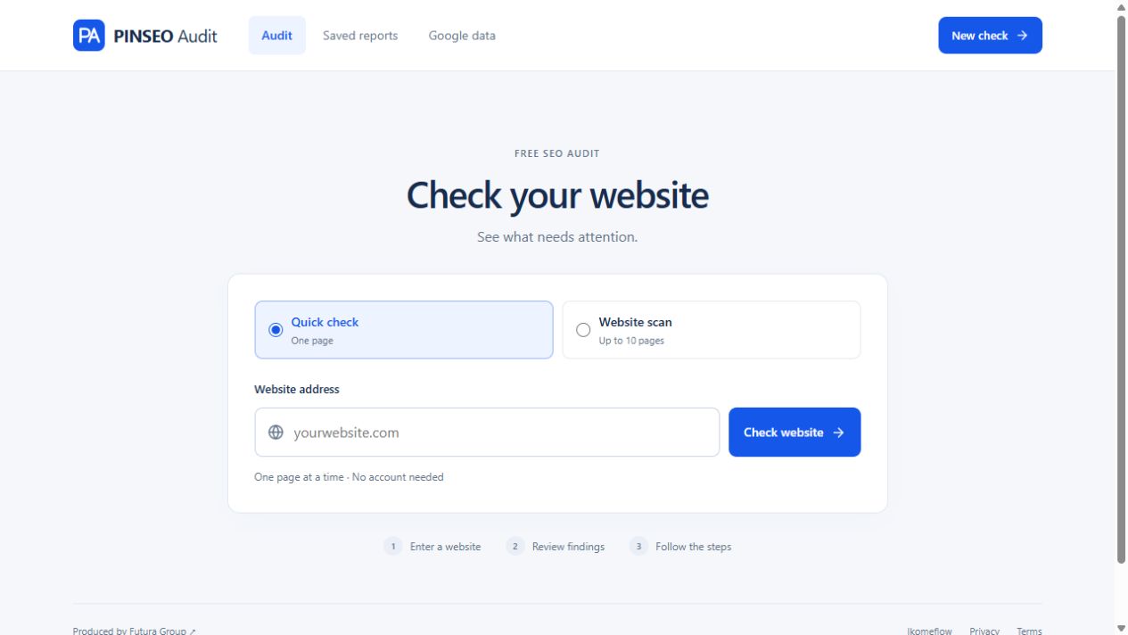
Prioritize tests that affect clarity and friction before minor design details. Good candidates include a revised value proposition, better product photography, clearer size guidance, delivery messaging near the purchase button, improved variation labels, or a simpler mobile layout. If traffic is limited, change one major issue at a time and compare results over a meaningful period rather than attempting complex split tests that cannot produce reliable findings.
Track more than conversion rate. Watch average order value, returns, support tickets, checkout abandonment, and repeat purchase behavior. A tactic such as aggressive discounting may lift immediate orders while reducing margin or attracting shoppers who do not return. The goal is profitable conversion, not a flattering dashboard number.
Turn Product Pages Into Sales Assets
A product page should work as a sales representative that is available around the clock. It should explain the offer consistently, handle predictable objections, support search visibility, and guide buyers toward the next action without pressure or confusion.
For growing stores, the best starting point is usually not a complete redesign. Choose the products with meaningful traffic or revenue, identify the biggest buying question each page fails to answer, and fix that first. Then build a repeatable product-page standard your team can apply across the catalog.
Futura Group approaches this work as part of a wider growth system: relevant search traffic, credible page experience, practical automation, and commercial measurement. Start with the buyer’s uncertainty, not the latest conversion trend. When a page makes the decision easier, better results tend to follow.
To compare product views, cart additions and completed orders, start with the Google Analytics ecommerce measurement guide.